Friday 30 May 2008

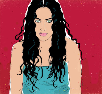
Portrait of a young man


A portrait I made for a magazine called Abecadło Zdrowia (Alphabet of Health), issue #1/2008. Simple and clean.

Thursday 29 May 2008

Same spread, three different styles

Here are three examples of how I designed the table of contents/letter from the editor spread in Leenia. The general idea of the layout in this magazine is that each issue should have its own original style and design.


The layout of issue #3 incorporated lots of handmade elements, dirt and fingerprints, splashes of paint etc. In this spread I used my sons plastic toy saw. I wanted it to look as if the toy had been stuck between the pages while printing.


The theme of issue #4 was photography. The layout was very, very black with lots of contrasts. Here I repeated the mirror effect from issue #3.


Issue #5 was all about movie making. The layout was clean with lots of white. The drawing and the rubber glove here refers to the headline of the letter from the editor, The First Clap. This is a joke in Polish as its the synonym of starting a film production but also the first clap (or rather slap) an infant gets from the doctor to start breathing.

Baby design


My friends' baby boy was going to be baptized. I wanted to give him something personal so I made this drawing. Jaś is short for Jan (John). I hope he'll appreciate it when he grows up.

Wednesday 28 May 2008

Cover up!


As a kid I had a passion for horror fiction and Dean Koontz was probably my favorite writer next to Stephen King and Peter Straub. A couple of years ago I got the chance to make a fewcovers for Prószyński, one of Poland's largest publishers. This was the third cover I made in the Dean Koontz series. The original title is Shadow Fires was but the Polish translation of the novelcalled The Immortal the . After I had made the first version of the cover the publisher changedtitle to... Shadow Fires.


This is the first version of the cover entitled The Immortal. By the way, those are my legs.


And this is the rough sketch.

Monday 26 May 2008

Soft and girlie


I only had one day to make this sleeve for a record to be inserted in TWIST – a teen mag for girls published by Bauer. The record was a compilation of Polish mainstream hip hop (yuck!) and the design had to be soft and girlie like the rest of the magazine. Not an easy task, I can assure you!

Graphic surgery


The Warsaw Insider – or simply The Insider – is Poland's oldest and biggest magazine for expats. Although it looks alright today it used to be a designers nightmare. The logo and layout must have been made in 15 minutes and one can only assume the reason for this was a short deadline of the first issue. In 2004 I was asked to make a new logo and a complete face lift to the layout. I only got as far as designing the logo. Shortly after this the title was sold to another publisher.

Friday 23 May 2008

Step back, Satan!


This is a t-shirt I made for people who need some extra protection from evil things. Can be quite handy sometimes.

Wednesday 21 May 2008

Unused portrait


We had a problem with the cover of the February issue of Diabetyk as we couldn't come up with a good photo of Józef Hen, the writer. The deadline was getting closer so I decide to draw his portrait. It came out pretty good but in the end we found a photo we could use instead. Too bad...

Monday 19 May 2008

Most famous logo


Probably my most famous and most frequently published logo. Mikropolis is the title of a comic I have been making with illustrator Krzysztof Gawronkiewicz since 1992 (I'm the text guy). It has been published over the years in more than ten magazines and newspapers in Poland and abroad, a handful of comic anthologies and two individual books. The first version of the logo dates back to 1992 and has since undergone a few modifications.

Mr Lee


This is my portrait of Lee Strasberg, the legendary founder of the Lee Strasberg Theatre & Film Institute.

It was recently published in Polish magazine Leenia #5 2008.

Keeping it simple


I really like this layout for a text about the new wave of protest songs in Polish rock and hip hop music. I made it for the last issue of Euro<26, a travel magazine for students. As I wanted to keep it simple I chose to use only black, red and white which in turn gives it a fanzine feel.


You can download the whole issue for free here.

Thursday 15 May 2008

Sugar free


Illustration for a magazine called Diabetyk. The article was about how schoolteachers treat pupils with diabetes.

And this is how it looked in the magazine.

Wednesday 14 May 2008

Puff of power


This cute poster with The Powerpuff Girls was made for an event called Artbus. It took place during the 2006 edition of the Łódź Comic Festival. One of the city's buses was turned into an art gallery showing posters of comic book superheroes.

Simply headmade


A logo I designed for my own company.

Architecture and ideology


I made this poster for festival screenings and the promotion of MDM, a documentary film by my good friend Eric Bednarski. The title refers to the Marszałkowska Housing District, a Social-Realist district built in central Warsaw in the 1950s. "Conceived on a monumental scale as a model of socialist planning and an architectural showpiece for the new Soviet-backed Communist regime, it rose up from the ruins of a city almost completely destroyed in World War II." Eric lives in Canada and works for the National Film Board.

Tuesday 13 May 2008

Polish pop star


This is a portrait of popstar/producer Kayah. I made it for a new business mag. Unfortunately the whole project is on hold right now.

Pink puppy


Just an illo I made for a girls magazine a few years back. And I still like it.

Monday 12 May 2008

I love gold


I design a Polish magazine called Leenia. It received The Golden Column Award (nagroda Złote Szpalty) for best custom publishing magazine of the year "...for the artistic ambitions reflected in the interesting design. For the courage to use black and white and playing with detail and layout." Leenia is published twice a year and is distributed for free in clothes shops and cafés.

Connecting past and present


The National Film Archive in Warsaw asked me to come up with a poster for various screenings in Poland and abroad (the headlines are changeable). They asked for a contemporary theme that communicates their goal: to connect the past and the present. In this version of the poster I used a modern skyline to underline the location of the Archive in Warsaw.

Friday 9 May 2008

Abstract blue


As my premiere post I'll use a drawing by my 3.5 year old son. He loves blue.